
What is Proximity in Design and the Difference Between Serif and Sans Serif?
Quick Answer
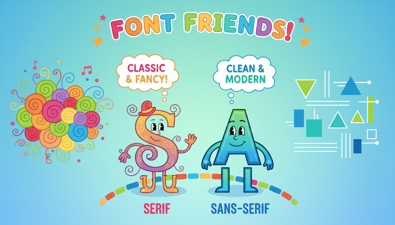
Proximity in design means placing related items close together to help viewers understand the content easily. Serif fonts have small lines at the ends of their letters, while sans serif fonts do not, giving them a cleaner look.
Proximity is a fundamental principle in design that helps organize content in a visually appealing and logical way. The basic idea behind proximity is simple: items that are related or that belong together should be grouped close to each other. This principle aids in quick comprehension, as our eyes naturally tend to group nearby elements together. When designing anything from a flyer to a website, understanding and applying the principle of proximity can significantly enhance the user experience.
**Understanding Proximity**
For instance, imagine you are looking at a school flyer advertising a spring concert. The title 'Spring Concert' is prominently displayed at the top, and right underneath it, you find the date, time, and location closely aligned. This design choice helps your brain quickly associate the important details with the main event. On the other hand, if the list of sponsors is placed on the opposite side of the page, it visually communicates that this information is secondary, thus guiding the viewer’s attention effectively.
Good examples of using proximity in design include:
- Grouping all contact information (like phone numbers and emails) in one corner of a business card, making it easy for viewers to find.
- Placing labels (like 'Name' or 'Email') near their corresponding text boxes on a form, reducing confusion during data entry.
- Keeping headings close to the paragraphs they introduce, allowing readers to quickly understand the topic.
**Serif vs. Sans Serif Fonts**
Now, let’s discuss the difference between serif and sans serif fonts, which is another foundational concept in design.
- **Serif fonts** have small decorative strokes, known as serifs, at the ends of their letters. Examples include Times New Roman and Georgia. These fonts are often seen as more traditional and are frequently used in print materials like books and newspapers. The presence of serifs can help guide the reader's eye along the lines of text, making it easier to read in longer passages.
- **Sans serif fonts**, on the other hand, do not have these decorative strokes. Examples include Arial and Helvetica. Sans serif fonts tend to have a more modern, clean look, making them popular for digital content and web design. They are typically easier to read on screens, especially at smaller sizes, which is why many websites prefer them for body text.
**Real-World Applications**
Understanding the difference between these two font types and the principle of proximity can greatly improve your design skills. In a professional setting, knowing when to use serif versus sans serif can affect the tone of your message. For instance, if you’re creating a formal invitation, a serif font might be more appropriate, while a sleek, modern website might benefit from a sans serif font.
In summary, mastering the principle of proximity and understanding serif and sans serif fonts are essential skills in design. They not only enhance visual appeal but also improve communication and comprehension for your audience.
Was this answer helpful?