
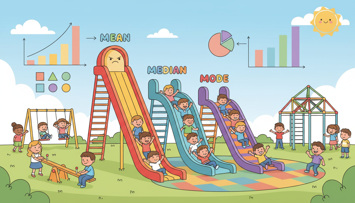
How to Match Measures of Center with Graph Shapes
Quick Answer
To correctly match measures of center to graph shapes, remember: the mean is best for symmetric data, while the median suits skewed data. For example, use the mean for a symmetric histogram and the median for a right-skewed one.
Understanding how to match measures of center, like the mean and median, to the appropriate graph shapes is crucial in statistics. Let's break it down using two common histogram shapes: skewed and symmetric.
1. **Mean and Median Defined**: The **mean** is the average of a data set, calculated by summing all values and dividing by the number of values. It is sensitive to extreme values or outliers. The **median**, on the other hand, is the middle value when data points are arranged in order. It is more robust against outliers, making it a better measure of center for skewed distributions.
2. **Identifying Graph Shapes**: In statistics, histograms can reveal a lot about your data distribution. A **skewed graph** (like a right-skewed distribution) has a tail that extends to one side, indicating that most data points are concentrated on one end. Conversely, a **symmetric graph** looks like a bell curve, where data points are evenly distributed around the center.
3. **Matching to Measures of Center**:
- For a **symmetric graph**, the mean is the best measure of center. This is because, in a symmetric distribution, the data points are evenly distributed around the mean, which gives an accurate representation of the center.
- In contrast, a **skewed graph** requires the median. Since extreme values can pull the mean away from the center, the median provides a better sense of a typical value in skewed distributions.
4. **Practical Example**: Imagine you have two sets of data:
- Set A: 1, 2, 3, 4, 5, 6, 100 (right-skewed due to the outlier, 100).
- Set B: 1, 2, 3, 4, 5, 6 (symmetric).
- For Set A, the mean is significantly higher (about 17.14) due to the outlier, while the median remains 3.5, a more accurate reflection of the typical value. For Set B, both the mean and median are 3.5, accurately representing the data.
5. **Real-World Applications**: Knowing when to use the mean or median can greatly influence data interpretation in fields like economics, healthcare, and education. For instance, in analyzing income data in a region, using the median might provide a clearer picture of typical earnings than the mean, especially if there are a few extremely high incomes that skew the average.
In summary, understanding the relationship between graph shapes and measures of center helps avoid common mistakes in data analysis. Always consider the data's distribution before deciding whether to use the mean or median to represent your data accurately.
Was this answer helpful?